


Avoid These Common Website Building Mistakes

Felabio H. Guerra

Building a website can feel like assembling IKEA furniture: fun initially, but soon you’re staring at a mess of parts wondering if you grabbed the right tool. Whether you’re launching a blog, an online store, or just securing your spot on the internet, common website mistakes can turn your project into a frustrating experience.
Let’s dive into the biggest website blunders and how to avoid them.
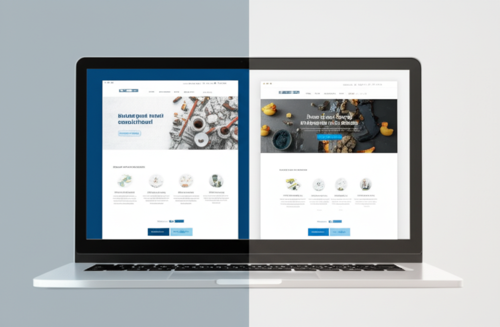
 Your website is your digital handshake. If it’s weak or confusing, visitors will leave faster than you can say “404 error.” You have mere seconds to grab attention, share your message, and inspire action. Confusing navigation, slow loading times, and poor design choices cause visitor drop-off and missed opportunities. According to the Nielsen Norman Group, avoiding these pitfalls boosts user engagement and conversions.
Key takeaway: A clean, intuitive website ensures happy visitors and better results.
Your website is your digital handshake. If it’s weak or confusing, visitors will leave faster than you can say “404 error.” You have mere seconds to grab attention, share your message, and inspire action. Confusing navigation, slow loading times, and poor design choices cause visitor drop-off and missed opportunities. According to the Nielsen Norman Group, avoiding these pitfalls boosts user engagement and conversions.
Key takeaway: A clean, intuitive website ensures happy visitors and better results.
 Ready to build a website that works? Start by auditing your current site or sketching a wireframe focused on user experience. Use tools like Google Lighthouse or WebPageTest for performance and accessibility analysis. Platforms like WordPress, Wix, and Squarespace offer responsive templates with built-in SEO to streamline your process.
Now, go create websites that impress visitors and deliver results! 🚀
Ready to build a website that works? Start by auditing your current site or sketching a wireframe focused on user experience. Use tools like Google Lighthouse or WebPageTest for performance and accessibility analysis. Platforms like WordPress, Wix, and Squarespace offer responsive templates with built-in SEO to streamline your process.
Now, go create websites that impress visitors and deliver results! 🚀
Why Avoiding These Common Website Mistakes Matters
Your website is your digital handshake. If it’s weak or confusing, visitors will leave faster than you can say “404 error.” You have mere seconds to grab attention, share your message, and inspire action. Confusing navigation, slow loading times, and poor design choices cause visitor drop-off and missed opportunities. According to the Nielsen Norman Group, avoiding these pitfalls boosts user engagement and conversions.
Key takeaway: A clean, intuitive website ensures happy visitors and better results.
Top Common Website Mistakes and How to Fix Them
1. Poor Navigation Design
Ambiguous menus confuse visitors, making them leave your site quickly. Think of website navigation like store aisles: clear labels and logical groupings help visitors find what they want. Fix:- Use clear menu labels, organize links logically, and include breadcrumbs so visitors always know where they are.
2. Weak or Missing Calls-to-Action (CTAs)
If your site doesn’t guide users on what to do next, they’ll hesitate and leave. Fix:- Use prominent, compelling CTAs like “Buy Now” or “Subscribe” placed where visitors naturally look.
3. Cluttered, Overloaded Design
Too many colors, images, and animations overwhelm visitors. Fix:- Embrace white space and focus on prioritizing key content to keep your site clean and easy to read.
4. Ignoring Mobile Responsiveness
More than half of web traffic comes from mobile devices. A poorly optimized mobile site drives visitors away. Fix:- Implement responsive design that adapts seamlessly from desktop to smartphone.
5. Accessibility Oversights
Ignoring accessibility features alienates users with disabilities and harms SEO. Fix:- Use proper color contrast, alt text for images, keyboard navigation, and semantic HTML to create an inclusive site.
6. Outdated or Unprofessional Design
Using outdated fonts or broken images damages credibility. Fix:- Choose modern templates and update visuals regularly to maintain a polished look.
7. Poor Typography Choices
Unreadable fonts or poor color contrast frustrate visitors. Fix:- Stick with 2-3 complementary fonts, readable sizes, and high contrast.
8. Ineffective Use of Whitespace
Crowded layouts overwhelm; excessive empty space bores. Fix:- Use whitespace strategically to improve readability and highlight important content.
9. Chaotic Content Structure
Random paragraphs without proper headings confuse visitors. Fix:- Use clear headings (H1, H2, H3), bullet points, and well-structured paragraphs.
10. Large, Unoptimized Media Files
Heavy images and videos slow loading times, causing user drop-off. Fix:- Compress files, use modern formats like WebP, and implement lazy loading.
11. Neglecting Basic SEO Fundamentals
If your site isn’t optimized for search engines, it won’t be found. Fix:- Use meta titles, descriptions, friendly URLs, alt tags, and internal linking to improve discoverability.
12. Using Default or Poor Naming Conventions
Generic file names like “page2” or “IMG_1234” hurt SEO and organization. Fix:- Use descriptive, relevant names for pages and files.
Bonus: Other Technical Mistakes to Avoid
- Copy-paste errors can introduce odd formatting and broken links—proofread carefully.
- Using images instead of text for important info harms SEO and accessibility.
- Ignoring analytics tools means missing insights to improve your site.
Real-World Impact
E-commerce sites with simplified checkout processes and progress indicators see conversion increases. Mobile-optimized blogs retain 30% more visitors. Nonprofit sites that implement alt text improve accessibility and donor engagement.Website Success Checklist ✅
- Clear, simple navigation
- Strong, visible CTAs
- Clean design with whitespace
- Mobile optimization
- Accessibility best practices
- Updated visuals
- Readable typography
- Logical content structure
- Optimized media files
- Basic SEO implementation
- Descriptive file naming
- Comprehensive testing before launch
Next Steps
Ready to build a website that works? Start by auditing your current site or sketching a wireframe focused on user experience. Use tools like Google Lighthouse or WebPageTest for performance and accessibility analysis. Platforms like WordPress, Wix, and Squarespace offer responsive templates with built-in SEO to streamline your process.
Now, go create websites that impress visitors and deliver results! 🚀Subscribe to Newsletter
Get updates in your inbox to stay up to date